In this post we’ll be looking at 3D visualization of various datasets using the data-projector software from Datacratic. The original demo didn’t impress us initially as much as it could, because the data there is synthetic - it shows a bunch of small spheres in rainbow colors. Real datasets look better.
UPDATE: See [How to make those 3D data visualizations)(http://fastml.com/how-to-make-those-3d-data-visualizations/).
The basic view in data-projector is a rotating cube. You can drag it any which way with your mouse. Use the mouse wheel to embiggen the cube. Click the image below to open the interactive visualization (opens in the same window; it make take a few seconds to load data and initialize). Then explore available options.

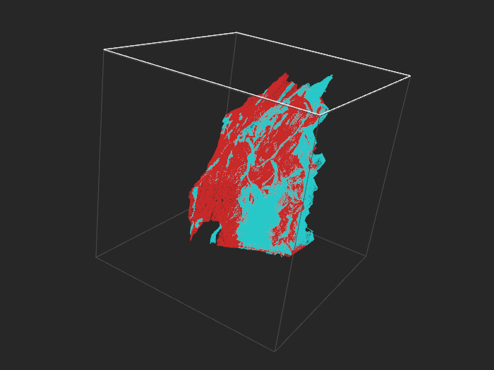
Adult (A9) - training set, 32k examples. Negatives turquoise, positives red.
The software is written in JavaScript and uses three.js library for 3D. The authors have 10000 points in the demo, but you can easily have many more on a desktop computer, as three.js employs hardware acceleration.
Below we show an example with more than half a million points, and even then animation performance isn’t a problem. However, with that many points input files become a bit large, so it might take a while to load data over a network. The data file for this example is more than 40MB.
Covertype (binary), 520k examples
With 520k points it gets dense. 50k points look about right.
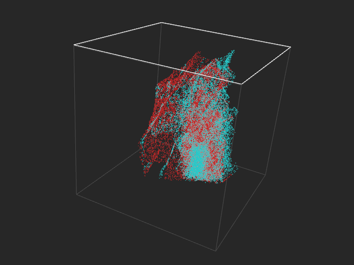
Covertype (binary), 52k examples
You can open the visualization locally, from a disk, but for us it only worked with Firefox. Apparently Chrome security settings don’t allow loading files from the disk with AJAX.
Usage scenarios

Data-projector is immediately suitable for binary and multi-class classification - each class has its own color. It could conceivably be adapted for regression, for example by dividing labels into ten or twenty bins and assigning colors so that they change smoothly from one bin to another. In fact, the software seems to assign cluster colors in this fashion automatically - see the image on the left.
Besides visualizing classes one could mark train set with one color and a test set with another to see if their distribution is the same (most machine learning methods work best when it is, but it often is not when time factor is involved).
Another option is to visualize predictions from a classifier, specifically to see where it confuses examples. To that end one would use four different colors to mark true positives, true negatives, false positives and false negatives.
Dimensionality reduction
Most datasets have many more features than three, so to visualize them you need to perform dimensionality reduction. The Datacratic article mentions SVD and t-SNE as means of reducing dimensionality of data to 3D.
In the examples we present here we employed PCA/SVD, as it’s the most basic option. Its advantage is speed - nonlinear methods might produce more interesting results but generally take much longer to run and don’t scale that well with number of examples.
t-SNE is a popular nonlinear choice for visualization. In an introduction to the Google talk by Laurens van der Maaten Geoff Hinton says that t-SNE is
a visualization technique that works better than any other technique for laying out large datasets in 2D maps, so you can see the structure of them.
This opinion is not surprising since Hinton is a co-creator of the method.
Another option is to use a supervised dimensionality reduction technique, for example metric learning (usually linear), or maybe a neural network with three units in the next-to-last layer.
Input format
Data-projector reads its input from a file, so it’s up to you what to put there, meaning that you can use any dimensionality reduction method you want. The input format is JSON - each point has x, y, z coordinates and a class ID. The data might look like this:
{"points": [
    {"y": "-92.26", "x": "3.83", "z": "-59.27", "cid": "0"},
    {"y": "22.91", "x": "53.42", "z": "-42.04", "cid": "1"},
    (...)
]}
More datasets
At the screenshots below you’ll see that each dataset has its own peculiar shape, different from the others.
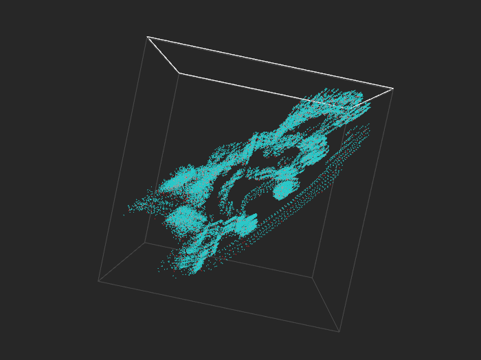
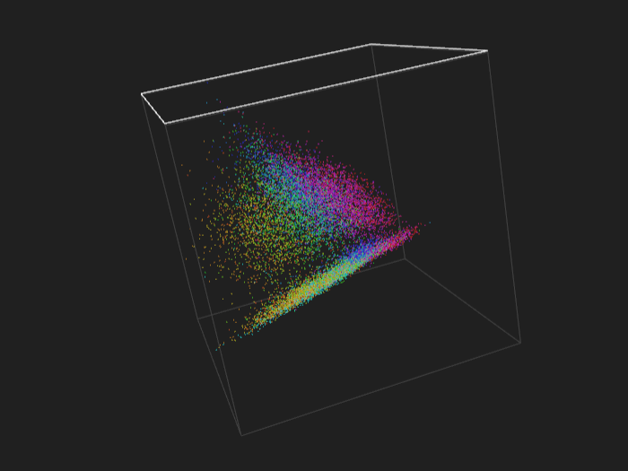
IJCNN - training set, 50k points
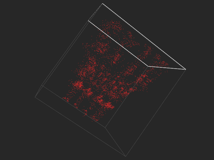
IJCNN - training set, another angle, positive examples only
Multiclass
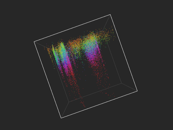
If you like rainbow colors, you should definitely try multiclass, and especially regression.
news20 - training set, 16k points
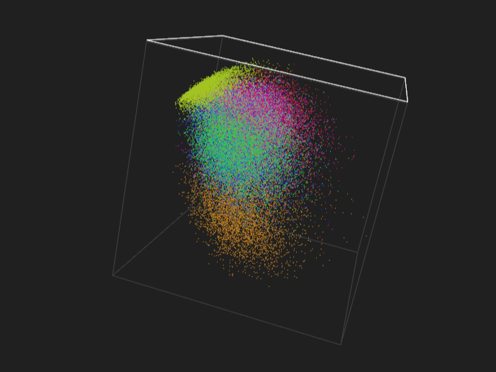
MNIST - training set, 60k points
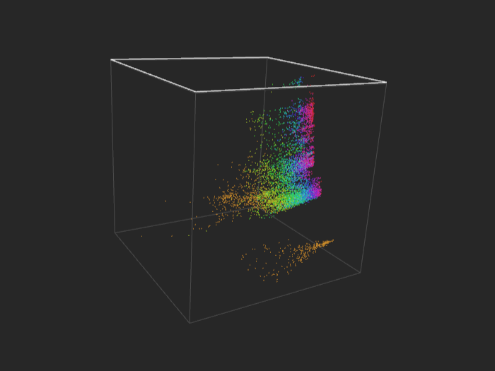
Regression
cadata - 21k points
cpusmall - 8k points
All the datasets come from the Libsvm repository.
UPDATE: See [How to make those 3D data visualizations)(http://fastml.com/how-to-make-those-3d-data-visualizations/).